![]()
What is a risk assessment matrix?
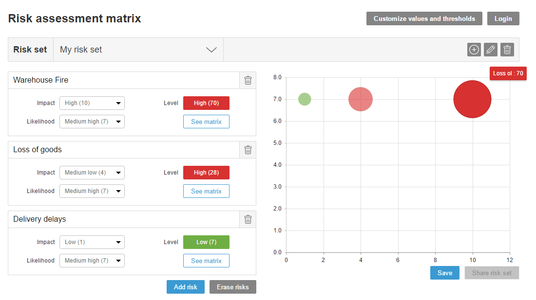
The matrix presents a set of risks on a graph where the x-axis represents the impact of risk and the y-axis represents the probability. For example, the impact of a fire occurring at the warehouse of a distribution company will be in the maximum values ––it’s a real catastrophe for business! However, since a good prevention plan makes this event highly unlikely, the resulting display places the risk in the upper left quadrant. Conversely, the same organization may also consider more probable risks of minor impact, such delays in delivery or even the loss of materials.
When viewing risks from these two parameters, the matrix allows to better compare and prioritize them. Results are often counter-intuitive. For example, one might think that a fire is the biggest risk, with loss of delivery items ranking second and delays at a solid third position. However, the fire prevention plan in the warehouse means the risk is very unlikely, while the volume of deliveries can fluctuate from “almost never” to one-digit percent points.
Obviously, if you never missed a delivery, your first mistake doesn’t count much. But when it happens every day, your reputation is at stake.
For managers of this imaginary company, it is essential to understand what is delaying drivers or preventing successful deliveries. Because deliveries can happen every day in the hundreds or thousands, a five percent delay rate can bring the company to the brink:
How does our matrix work?
We have set the matrix to display three default risks that you can probably apply to any project: loss of personnel, scope changes and company acquisition. You can then adjust values of probability and impact in these fields, or erase them all and start from scratch.
For each new risk follow these three steps:
- Click on the button "Add risk"
- Give it a name that describes it
- Assign impact and probability values
Each time you create a risk, it appears in the chart (the risk label will show if you hover over it), and once you have defined several different risks you will see that the circle size varies depending on the level of risk exposure.
Customize, save and share your risk sets
The colors depend on the assigned risk thresholds by default, but you have the option to edit risk thresholds and impact and probability values by clicking the button "customize values and thresholds".
Since we want the tool to be useful, you can also register via the "login" button to store all your risk sets, saving them for future reference.
Don’t forget to share the tool if you liked it! And if you want the risk matrix to be systematically linked to your current projects, we recommend you try ITM Platform for free. You will have access to the most comprehensive project, programs and portfolio management tool on the market.