Tracking Projects Based on Agile Methodology
![]()
Unlike with Waterfall-managed projects (Gantt), a schedule is not required for projects based on agile methodology since they are not predictive. Therefore, the method for tracking progress differs significantly.
The following article explains how to track progress in projects managed using agile methodology, with special focus on the Burndown Chart and Cumulative Flow Diagram (CFD).
Likewise, tracking progress will differ depending on whether the project is managed using Scrum or Kanban. These techniques have similarities, but also significant differences in purpose.
Burndown Chart
Represents the dynamics of tasks completed.
The Burndown chart is generally used when all tasks are determined from the beginning.
Let’s look at an example:
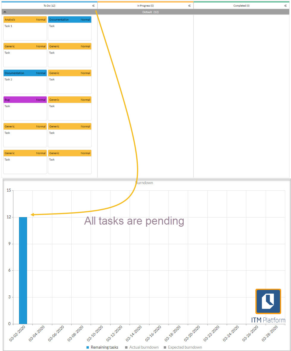
Notice that the backlog shows tasks that are created on the same day. Let’s see what happens if we move one to “Completed” status and another to “In Progress”.
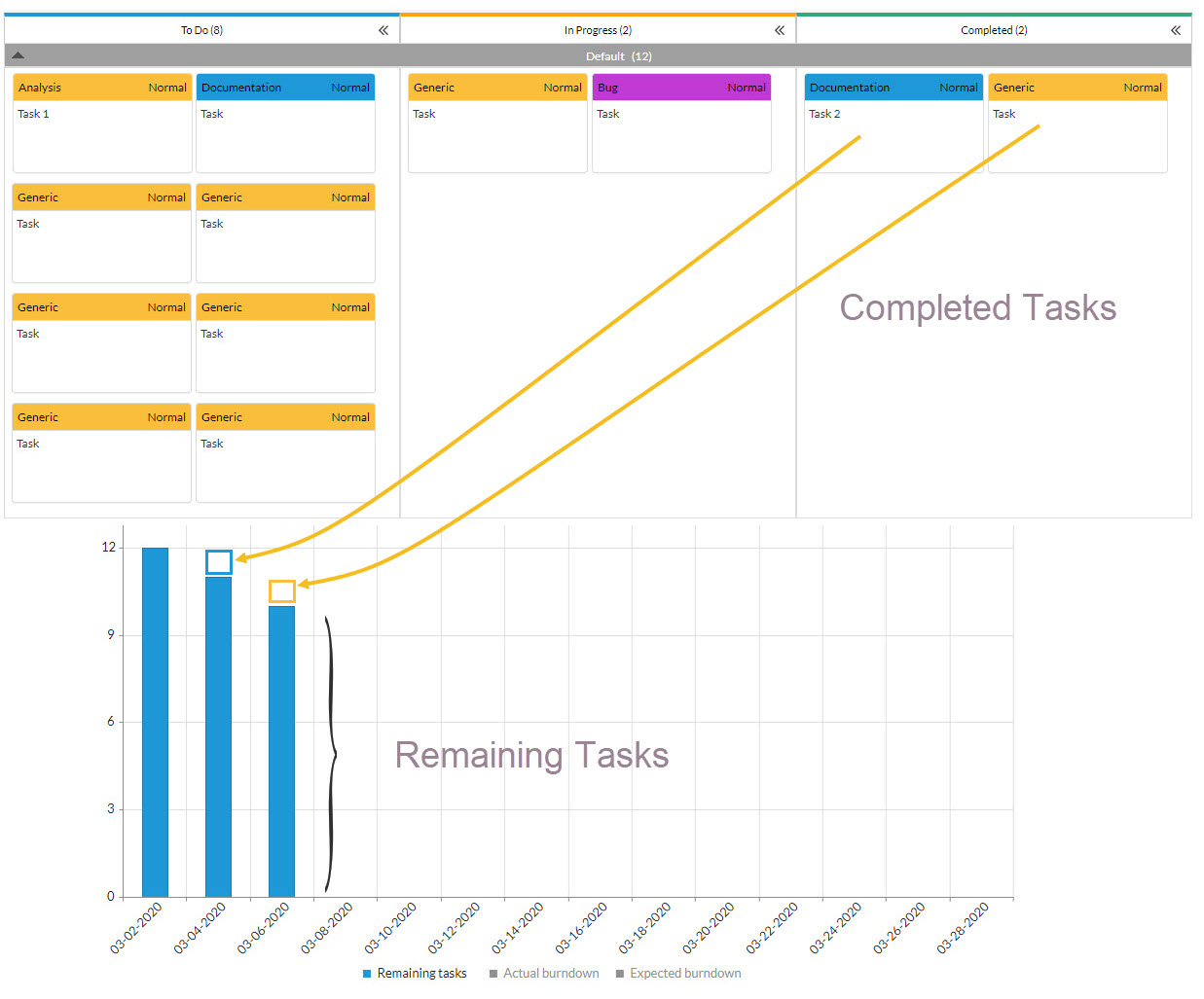
If we follow the completion rate of tasks, we will eventually leave the work column pending to zero.
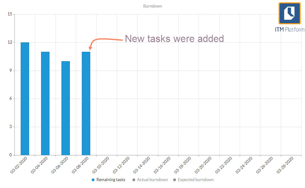
However, if we add “To Do” tasks as the project or sprint continues, we will notice anomalies in the trend because instead of reducing the backlog, it will increase.
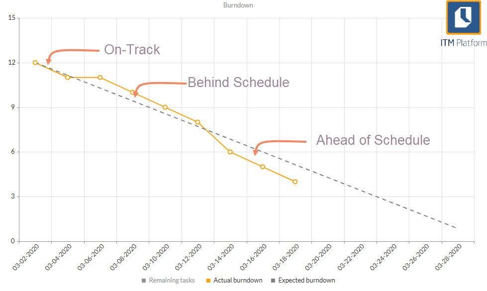
Expected line of progress
This is a straight line that connects the number of tasks in the “To Do” status on the Y-axis to the beginning of the interval on the X-axis. By the end, there should be no pending tasks (Y-axis =0), so the line is steadily declining.
If the tasks are of similar size, the number of pending tasks at any point in time should follow the expected progress line.
Actual line of progress
Represents the actual number of tasks pending by intervals. That is, the overall pending tasks at the start minus those completed. We’ve explained this concept before with a bar chart example.
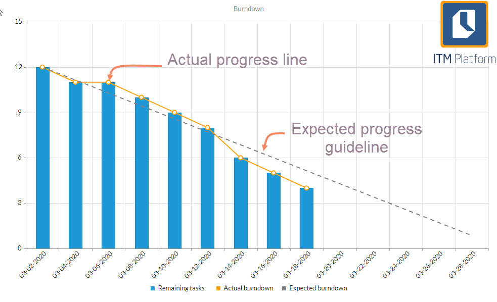
The slope of the progress line indicates the “velocity” and determines the number of tasks completed per time block (usually a sprint).
How to interpret a Burndown chart
On-track: The expected and actual line of progress are together. If it keeps this pace, the project will end in time.
Behind schedule: If the actual progress line is above the expected line, it means that the team is delayed and should have completed more work at this point.
Ahead of schedule: If the actual line of progress is below expected, it is progressing at a faster pace than expected. You can finish earlier than expected or add tasks. These interpretations are valid as long as the tasks are the same size, i.e. the time to solve them is similar.
Burndown Diagram Limitations
The Burndown diagram only represents the completed work. It reports the pending work, but it doesn’t reflect what is in progress.
Burndown works best on sprints or short projects and makes less sense with long-term projects. In long-term projects, pending work goes through many changes in order for the estimates to make any sense. That is the main reason why Burndown is not recommended for the Kanban technique.
The Burndown diagram does not represent scope changes, as changes in the backlog are not displayed effectively. These limitations are overcome by the Cumulative Flow Diagram.
Cumulative Flow Diagram (CFD)
A Cumulative Flow diagram is a stacked area chart that shows, for each time interval, the number of tasks per status.
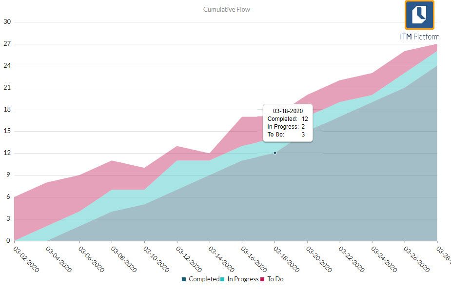
Reading the Cumulative Flow Diagram
As you go along, the diagram shows the flow of tasks by status. It is called ‘cumulative’ because it does not measure increments between intervals but counts all the tasks for each status, regardless of whether or not that was their status before.
This solves the main problem with Burndown, as it reflects situations in which not all to-dos are created on the first day.
The CFD provides two fundamental pieces of information in agile management: Work in Progress (WIP) and Cycle Time (CT).
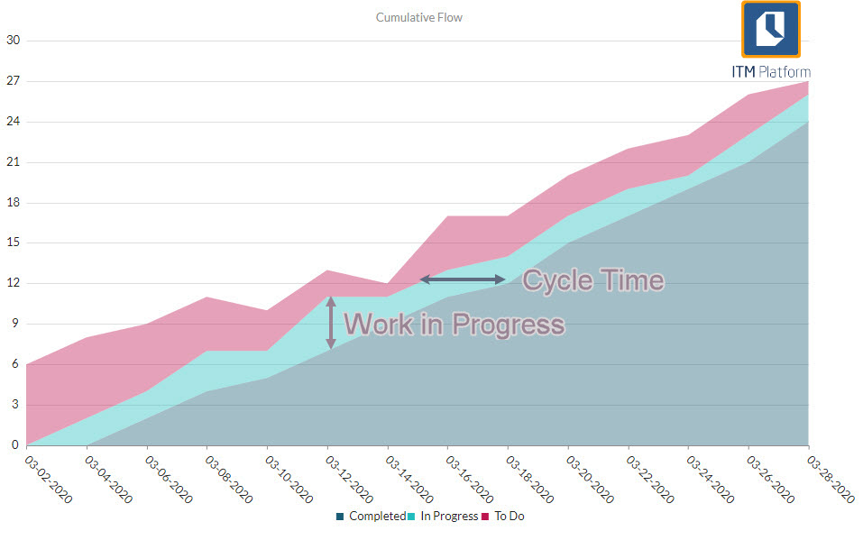
The ‘In Progress’ bandwidth represents work in progress (WIP).
The space between time intervals represents the average time it takes a task to move from one status to another, the Cycle Time (CT).
Limitations of the Cumulative Flow Diagram
Despite solving the main limitations of the Burndown chart, the CFD has its own limitations.
- It does not reflect whether any task is not progressing
- Nor does it indicate the individual cycle time, that is the amount of time that a particular task has remained at a single stage.
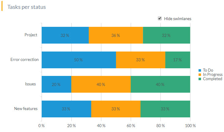
Tracking Tasks by Status
This way of tracking progress is the simplest because it reflects the percentage of tasks in each status at any given time.
The standard status types – ‘To Do’, ‘In Progress’ and ‘Completed’ – are independent of the number of columns on the Agile board because each column is based on one of these three types.
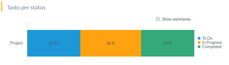
Tasks per status can be seen in either the group or swimlane view.
You can also eliminate one of the statuses and in turn the chart will be recalculated based on 100 and display the remaining statuses.
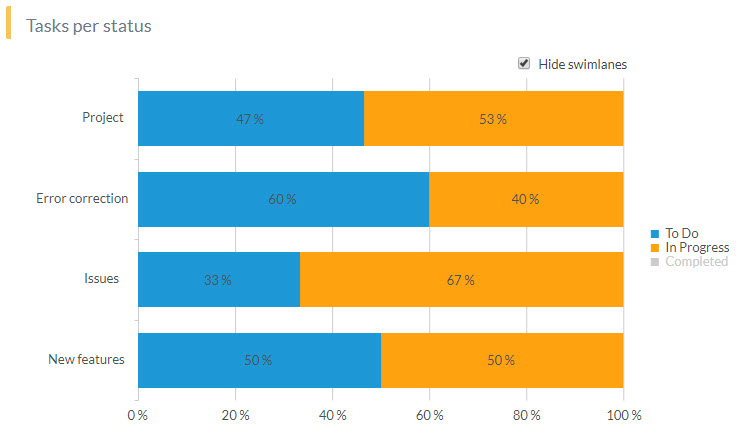
Here we have removed the ‘Completed’ status and now you are left with ‘To Do’ and ‘In Progress’.
Try ITM Platform free for 14 days
Start managing your projects, resources, and portfolios today.