Data Visualization in Project Portfolio Management: A Practical Guide

Project portfolio management lives or dies on the speed at which leadership can read the data. Schedules, budgets, resource allocation, risk scores, dependencies between projects: it is a lot to hold in your head, and a status report longer than one page is a status report nobody reads.
Data visualization is what closes that gap. Done well, it turns a portfolio’s worth of numbers into something a PMO leader can scan in two minutes and a steering committee can debate without a tutorial. Done poorly, it just adds noise.
This guide is for PMO leaders, project managers and analysts who already know the data is there and want to make it useful. We will cover where visualization actually moves the needle in PPM, which chart types fit which questions, and the habits that separate a dashboard that gets checked daily from one that gets ignored.
Data visualization in aligning PPM to business strategy
Pretty charts are not the point. The point is to see, at a glance, whether the portfolio is doing what the business asked it to do. Aligned to strategy, a small set of well-chosen visualizations answers questions executives genuinely care about: where is the money going, where are we falling behind, and what should we stop doing.
Strategic planning and execution monitoring are the two arenas where visualization earns its keep. The questions are concrete: are we investing in the right things, and are those investments actually delivering.
Concretely, that means visualizing things like:
- Investment per strategic goal, so a CFO can see at a glance whether the portfolio matches the stated priorities.
- Areas of low performance, surfaced before they need rescuing.
- Resource allocation against demand, with bottlenecks made visible rather than left to be discovered.
- Risk exposure mapped against expected value, so trade-offs are explicit.
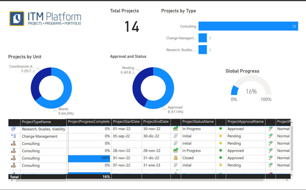
These are exactly the dimensions a portfolio view aggregates across projects and services, with general, financial, schedule and progress tabs designed for the questions a steering committee will actually ask.
Main types of data visualization for PPM
The craft of visualization is picking a format that lets the eye do the work the brain would otherwise have to do. A good chart reveals the pattern in the data; a bad chart hides it behind a wall of ink.
Most PPM reporting reduces to four workhorse chart types. They are not glamorous, and they do not need to be.
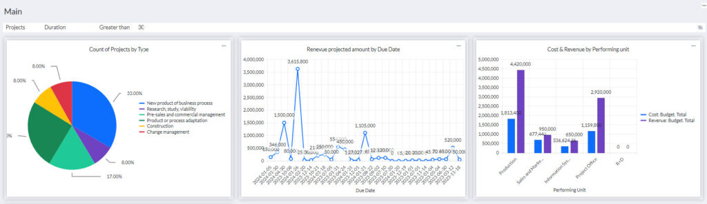
- Bar charts. The right choice for comparing values across categories: project budgets, hours by team, deliverables per phase. They are easy to read and they scale to long lists without breaking down. A bar chart showing total spend per project across a portfolio tells you in two seconds where the money is concentrated.
- Column charts. A vertical bar chart. Same logic, but better when the category labels are short or when you are comparing values across time slots (one column per month, for example). Useful for tracking the progress of several projects side by side.
- Line charts. The native format for time series. Track cumulative cost, percent complete or earned value over the life of a project, and the slope tells you whether things are accelerating or stalling. Line charts are weak when you try to push too many series onto the same axes, so keep them focused.
- Pie charts. Useful for composition: what share of the portfolio sits in each program, what percentage of capacity goes to run-the-business versus change-the-business. They lose their power past five or six slices, so resist the urge to add more.
When choosing a visual, think about four things: the type of data (categorical, numerical, time-based), the goal of the visualization (comparison, trend, composition), the complexity of the data (how many points and categories), and the audience (executives want one chart per question, analysts can handle more).
A short cheat sheet:
- Categorical comparison: bar or column chart.
- Trend over time: line chart.
- Composition of a whole: pie chart.
- Many data points, few categories: column or line chart.
- Many data points and many categories: grouped or stacked bar chart.
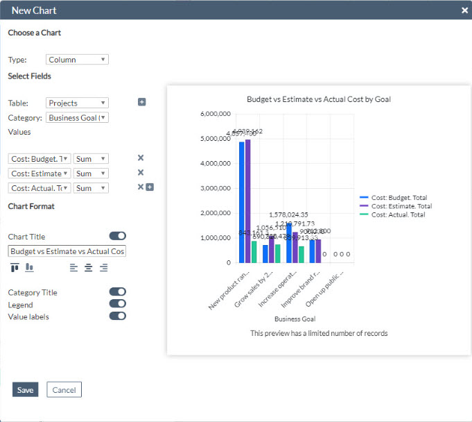
In practice, PMOs do not draw these charts one at a time, they assemble them into dashboards that get checked alongside the morning coffee. ITM Platform’s customizable dashboards let you build that view directly from portfolio data, mixing bar, column, line, area and pie charts over projects, tasks, risks, issues and finances, with shared filters and permissions so the same numbers reach everyone.
Best practices for data visualization in PPM
Ensure the underlying data is right.
A clean chart over dirty data is worse than no chart at all, because it lends false confidence. Before publishing anything, confirm the source of each metric, when it was last updated, and who owns it. Resource utilization that is two months stale will quietly mislead the next staffing decision.
Choose KPIs that map to decisions.
A KPI that does not change anyone’s behavior is a vanity metric. For portfolio reporting, focus on a small set that actually drives decisions: schedule variance, cost variance, percent complete, resource utilization, risk exposure. If you find yourself adding a metric “because we have it,” delete it.
For PMOs that do not want to design this from scratch, ITM Platform ships a set of Power BI templates (Health Indicators, Project Status Summary, Financial Analysis, Effort Analysis, and others) that already pre-select the KPIs most portfolios care about. Starting from a template and trimming is usually faster than starting from a blank canvas. For a longer take on which indicators to track, see our piece on the seven essential project indicators.
Keep visualizations clear and concise.
Simplicity wins. Each chart should answer one question. Strip out gridlines that do not earn their place, drop legends when a direct label will do, and resist the temptation to add a second y-axis just because the data crosses scales. If you cannot explain a chart in one sentence, it is doing too much.
Use color, layout and design with intent.
Color is a tool, not decoration. Reserve it for what matters: a red bar for the project over budget, a single highlighted line for the one trend that needs attention, a consistent palette to identify the same program across charts. Match the layout to how the eye reads, top-left first, and lead the viewer through the story you want them to take away.
Avoid the common traps.
A short list of mistakes that show up again and again in portfolio reporting:
- Overloading a single chart. Cluttering one visualization with every metric you have available is the fastest way to ensure none of them land. Split it up.
- Wrong chart for the question. A pie chart with twelve slices, a line chart with eight series, a bar chart sorted by alphabet instead of value. Use the cheat sheet above.
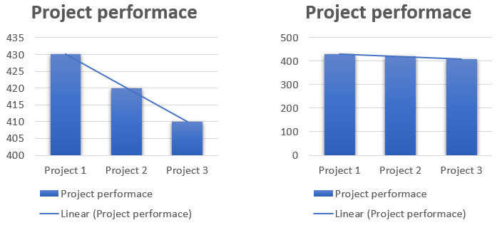
- Misleading scales. Truncated y-axes, inconsistent intervals, and changed denominators between periods all distort the story. Two charts of the same data should not lead to opposite conclusions.
- Ignoring data quality. Treat the data pipeline behind the chart as part of the chart. If you cannot vouch for the source, do not publish the visualization.
Tools for data visualization in PPM
Most PMOs end up with a mix of in-product reporting and a BI layer for deeper analysis. Both have a place.
Built-in dashboards. A PPM tool with native dashboards keeps the loop tight: the people generating the data see it visualized without an extra ETL step. ITM Platform’s dashboards are built directly over portfolio data, with pre-built views and a builder for custom ones. Because the data does not leave the system, what stakeholders see is what their teams are reporting today, not a snapshot from last week.
Power BI. When the analysis goes beyond what an embedded dashboard can comfortably show (custom data models, blending portfolio data with finance or CRM data, polished executive reports), Power BI is the obvious step up. The ITM Platform Power BI templates are designed for exactly that path.
Other BI tools via API. Tableau, Qlik or any other BI tool can consume ITM Platform data through the public API. Useful when an organization has already standardized on a different stack and wants portfolio data to land alongside everything else.
Key takeaways
Data visualization is not a decorative layer on top of PPM, it is the part that makes PPM legible. A few principles repeat:
- Choose the chart that fits the question, not the one that looks best in a slide deck.
- Curate KPIs ruthlessly. A short list of metrics that drive decisions beats a long list of metrics that drive meetings.
- Trust your data sources before you trust your charts.
- Design for the audience and their attention span.
The PMOs that get this right do not just produce nicer reports. They make the whole portfolio visible enough that the next decision, on budget, on staffing, on which project to stop, can be made on data instead of instinct.
Try ITM Platform free for 14 days
Start managing your projects, resources, and portfolios today.